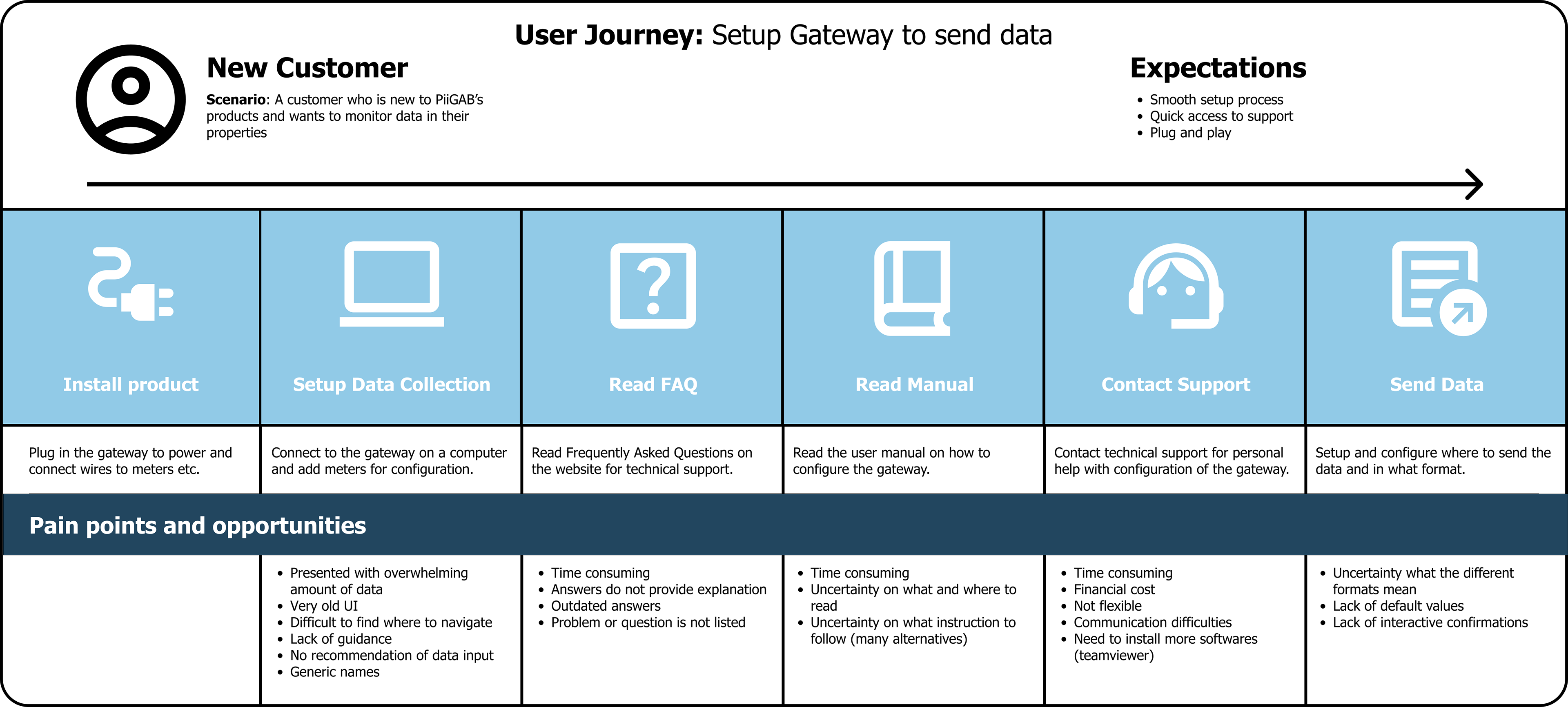
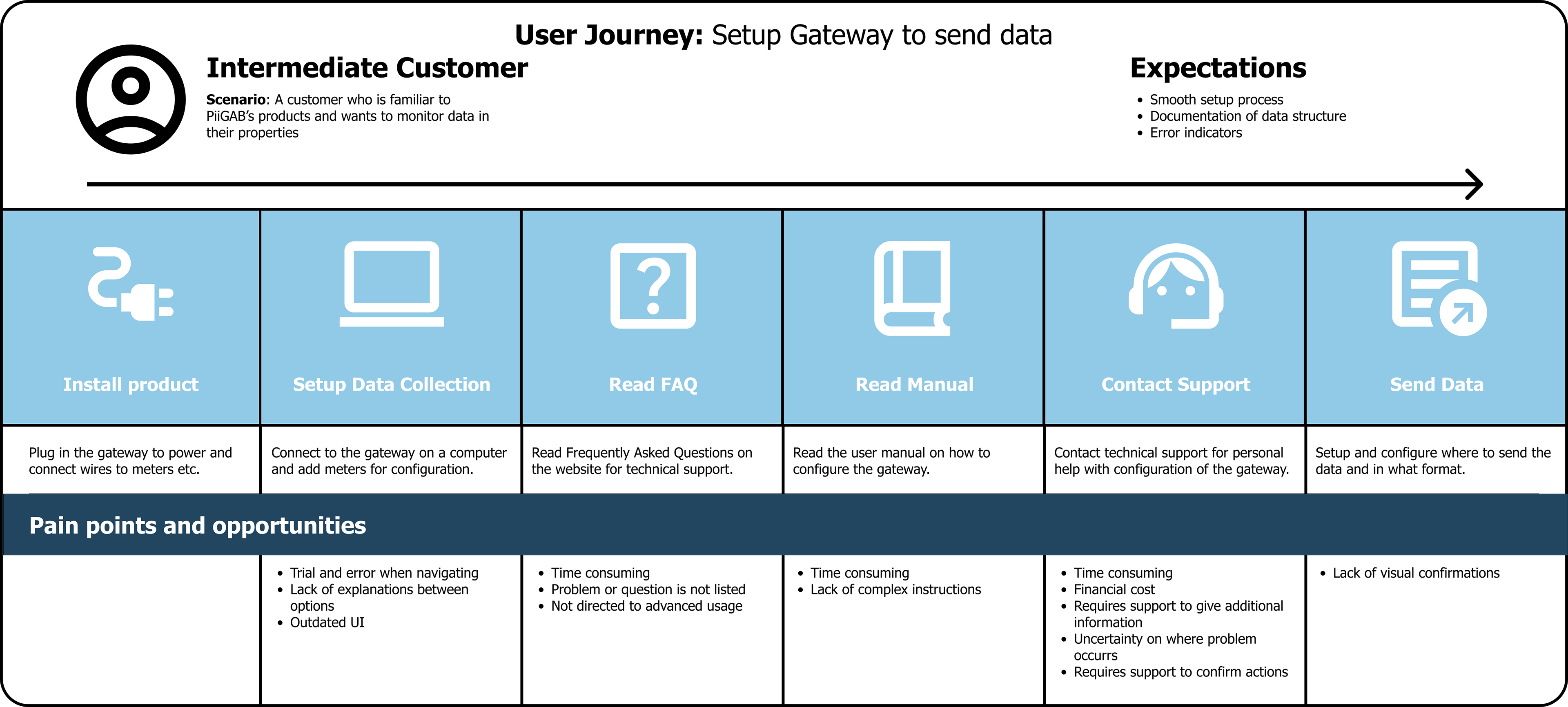
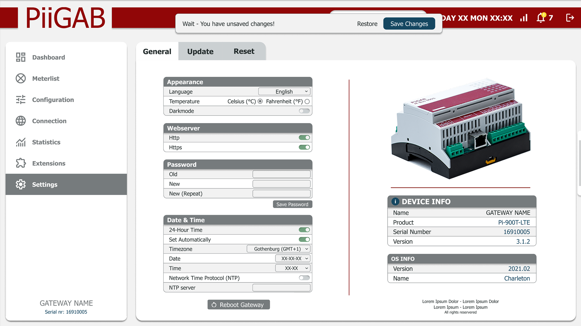
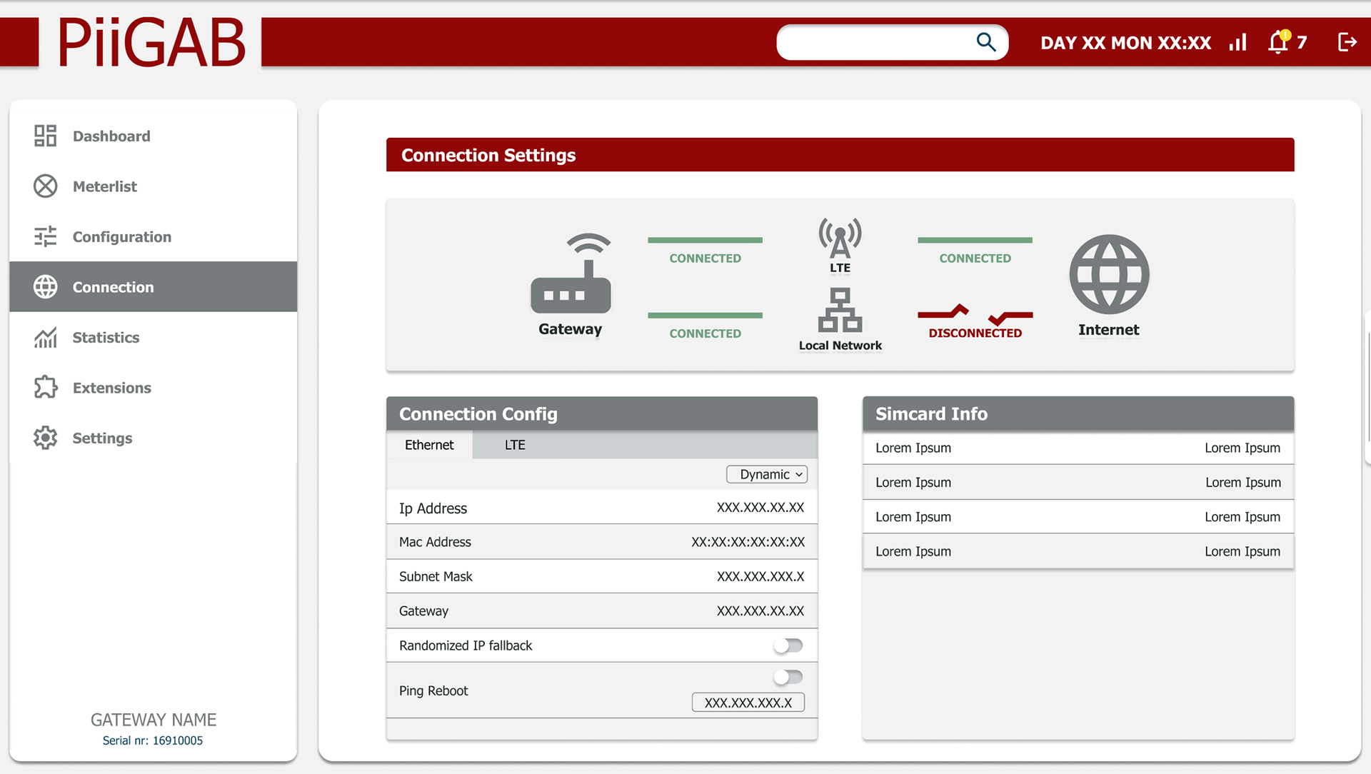
A web-based configuration system was redesigned to be more intuitive, efficient, and visually appealing for users with different expertise levels.
Goal: Streamline complex workflows without sacrificing advanced functionality.
Goal: Streamline complex workflows without sacrificing advanced functionality.
Key Improvements
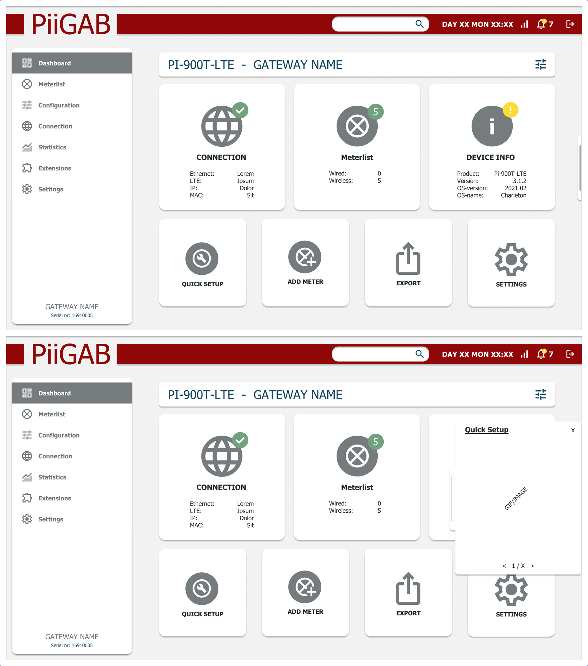
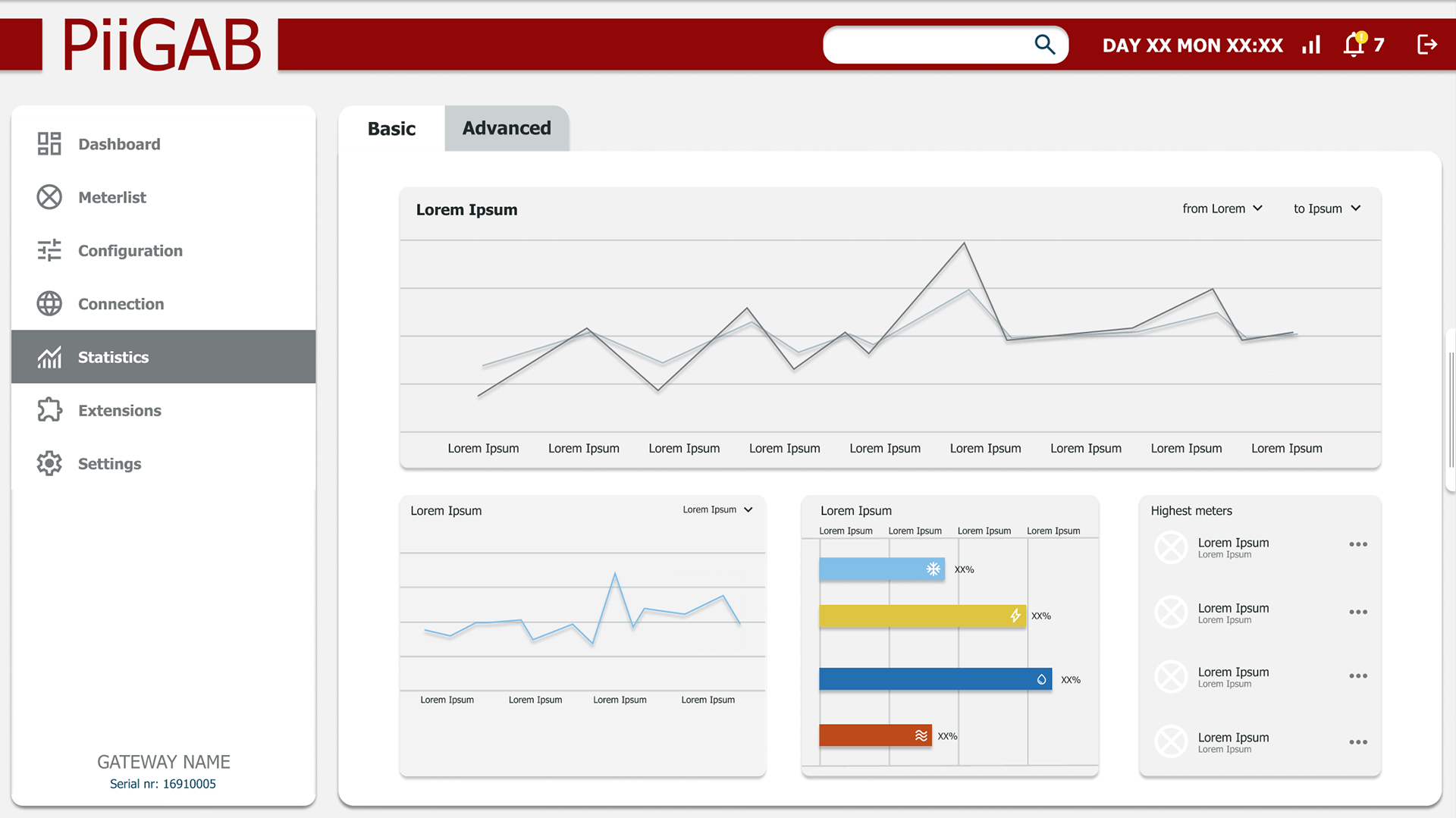
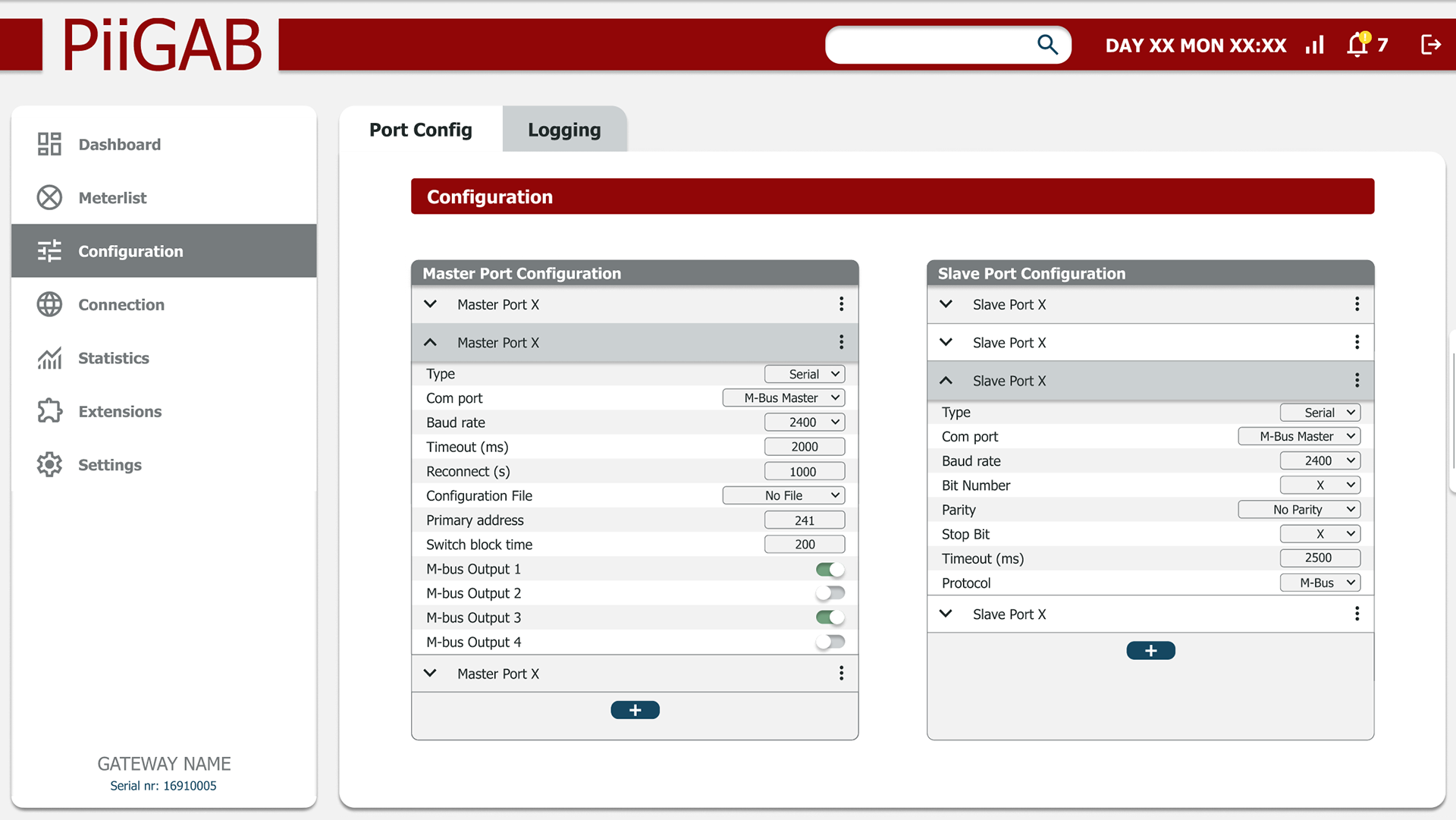
Clearer Navigation – Simplified menus and improved labeling.
Better Feedback – Visual cues and instant system responses.
Streamlined Workflows – Reduced clicks for common tasks.
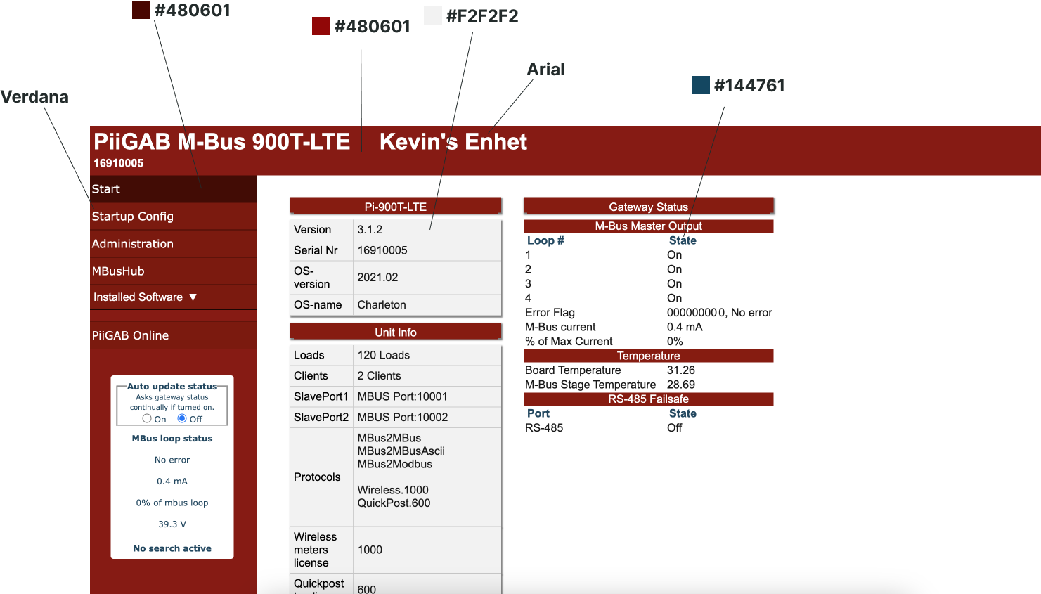
Modern Visual Design – Consistent colors, typography, and spacing.
I led the user-centered design process, from research to high-fidelity prototypes:
1. User Research – Interviews, workflow analysis, and pain point mapping.
2. Wireframing – Low-fidelity sketches to explore navigation and layout.
3. Interactive Prototyping – Clickable prototypes for early feedback.
4. Usability Testing – Iterations based on real user input.
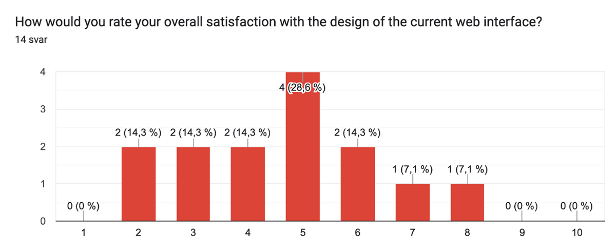
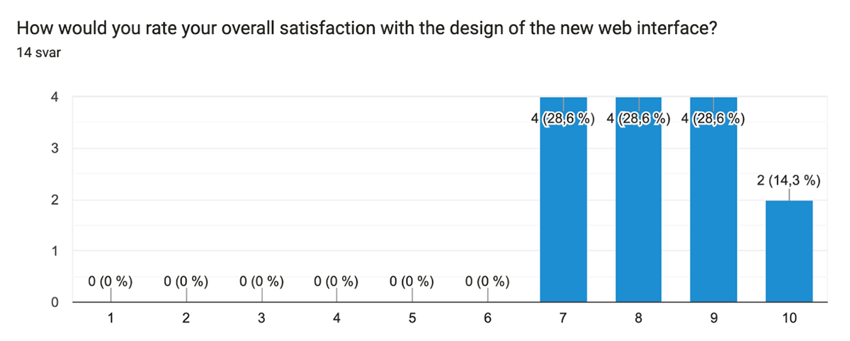
Results
✅ Positive feedback from both novice and advanced users
✅ Faster task completion and fewer navigation errors (based on testing)
✅ Clearer, more approachable design without losing depth for experts
✅ Faster task completion and fewer navigation errors (based on testing)
✅ Clearer, more approachable design without losing depth for experts